Posted on Leave a comment

Importance of Graphic Design with CMYK

CMYK Printing

Importance of Graphic Design with CMYK

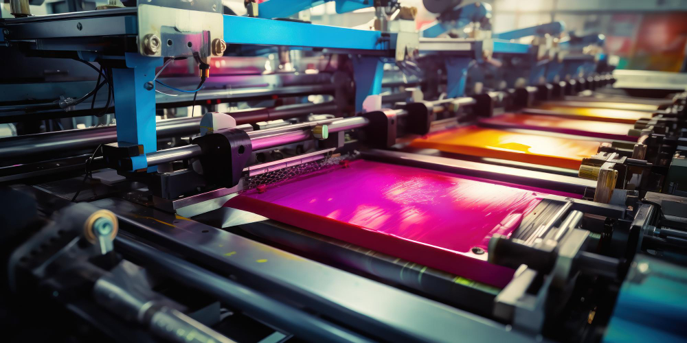
Graphic design with CMYK (Cyan, Magenta, Yellow, Black) is essential for producing high-quality printed materials. Unlike RGB, which is used for screens, CMYK ensures accurate color reproduction in physical prints. It provides consistent print quality, making brochures, business cards, and posters appear vibrant and sharp.

Using CMYK allows for precise color control, as designers can adjust ink percentages to create specific shades and gradients. This accuracy is vital for maintaining brand consistency, ensuring logos and marketing materials look the same across different print runs.

CMYK-based design also prevents color discrepancies between digital previews and final prints. By working directly in CMYK, designers avoid unexpected color shifts, ensuring the printed result matches their vision.

Moreover, it enhances cost-effective printing by reducing ink waste and streamlining the production process. With CMYK, printers achieve efficient color layering, minimizing errors and ensuring clean, professional output.

For marketing, CMYK ensures crisp, eye-catching visuals, making promotional materials stand out. It also plays a key role in packaging design, where consistent colors build brand recognition.

Overall, CMYK is essential in graphic design for delivering visually appealing, accurate, and professional-quality printed materials.

Posted on 1 Comment

How to Design Commercial Material – Step-by-Step

Graphic Design

How to Design Commercial Material – Step-by-Step

  1. Define Purpose & Audience:
    • Identify the goal: promotion, branding, or sales.
    • Understand your target audience: age, interests, and preferences.
    • Example: A flyer for teenagers needs vibrant colors and trendy fonts, while corporate brochures require a professional tone.
  2. Choose Format & Size:
    • Select the appropriate material: flyers, posters, brochures, business cards, or signboards.
    • Determine dimensions based on content and purpose.
    • Example: A tri-fold brochure fits more information, while a flyer is better for quick promotion.
  3. Create a Layout:
    • Use a grid system to ensure balance and alignment.
    • Arrange elements (images, text, and logo) for readability.
    • Leave sufficient white space to avoid clutter.
  4. Use High-Quality Images:
    • Include clear, sharp, and relevant visuals.
    • Ensure images are high resolution (300 DPI) and in CMYK for printing.
    • Use stock photos or professional photography if needed.
  5. Consistent Branding:
    • Apply brand colors, fonts, and logo consistently.
    • Ensure all marketing material maintains a uniform look.
    • Example: Use the same logo placement and color scheme across business cards, brochures, and signage.
  6. Clear and Compelling Messaging:
    • Use concise, engaging text with a clear call-to-action (CTA).
    • Highlight benefits and key points.
    • Example: “Order Now for Free Delivery!” or “Call Today for a Free Quote!”
  7. Typography and Readability:
    • Use professional, easy-to-read fonts.
    • Maintain a proper contrast between text and background.
    • Example: Avoid cursive fonts for important details; use bold or uppercase for emphasis.
  8. Color Psychology:
    • Choose colors that evoke the right emotions.
    • Example: Blue for trust, red for urgency, green for freshness.
    • Maintain consistency with brand colors.
  9. Proof & Print:
    • Double-check spelling, grammar, and contact details.
    • Print a sample first to verify colors and quality.
    • Use high-resolution settings and quality paper for a professional finish.

Tip: Use design tools like Canva, Adobe InDesign, or Figma for professional results.