Posted on Leave a comment

Understanding Anomalies in Daily Key Events in Google Analytics (GA4)

Anamoly in G4A john printing

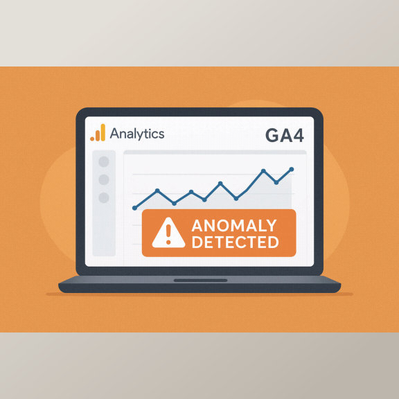
In the world of digital marketing, tracking your website’s performance accurately is crucial. Google Analytics 4 (GA4) introduces a smart feature called “Anomaly Detection” to help you easily identify unusual changes in your website data — especially in daily key events like page views, purchases, or form submissions.


What Is an Anomaly in Google Analytics?

An anomaly simply means something unexpected or out of the ordinary in your data.
For example, if your website usually receives 100 “contact form submissions” per day, but one day it jumps to 300 or drops to 10 — GA4 will highlight that day as an anomaly.

Google Analytics uses machine learning algorithms to study your past data and predict what’s “normal.” When your actual results go beyond or below that expected range, it flags it as an anomaly.


Why Anomalies Occur

There are many reasons your data might show unexpected behavior.
Here are some common causes:

  • 🔹 A successful new ad campaign or special offer
  • 🔹 Website downtime or tracking code errors
  • 🔹 Sudden traffic spikes from social media or influencers
  • 🔹 Seasonal trends, like festive offers or holidays
  • 🔹 Major content updates or new product launches

How to Use Anomaly Detection

When GA4 detects an anomaly in your Daily Key Events:

  1. Click the highlighted anomaly to view details.
  2. Compare your expected range vs. actual performance.
  3. Review your marketing activities for that date — did you run a new ad or post something viral?
  4. If it’s a negative anomaly, check for tracking issues, slow pages, or reduced campaign reach.
  5. If it’s positive, replicate what worked to boost your performance again.

Why It Matters for Small Businesses

For small business owners and marketers, anomaly detection is like having a digital assistant watching your data 24/7.
It helps you:

  • Spot issues early
  • Measure campaign effectiveness
  • Understand customer behavior changes
  • Make faster, smarter business decisions

Final Thoughts

Anomalies aren’t always bad — they’re opportunities to learn, adjust, and grow. Whether your traffic unexpectedly increases or decreases, GA4’s anomaly detection helps you stay informed and in control of your digital performance.

Keep monitoring your analytics regularly to ensure your marketing efforts deliver consistent, predictable results.

Posted on Leave a comment

Difference Between Matte and Glossy Business Cards

When it comes to printing business cards, one of the most common questions customers ask is — “Which is better: Matte or Glossy?” Both finishes look professional, but they create very different impressions. Understanding their differences helps you choose the right style for your brand. 🖤 What Is a Matte Business Card? A matte finish gives your business card a smooth, non-reflective surface. It feels soft to touch and looks elegant, making it ideal for a minimalist or premium look. ✅ Advantages of Matte Finish: Soft, classy, and professional appearance No glare — easy to read under any lighting Resistant to fingerprints and smudges Perfect for subtle, modern designs Matte cards are popular among corporates, consultants, and professionals who prefer a clean and understated brand image. ✨ What Is a Glossy Business Card? A glossy finish has a shiny, reflective coating that enhances colors and details. It’s vibrant and attention-grabbing — perfect for creative, bold designs. ✅ Advantages of Glossy Finish: Bright, sharp, and colorful appearance Protects against moisture and wear Ideal for image-heavy or colorful designs Looks eye-catching in marketing materials Glossy cards are often chosen by artists, photographers, and retail brands that want their visuals to pop. ⚖️ Matte vs Glossy: Which One Should You Choose? Feature Matte Finish Glossy Finish Look Elegant & modern Bright & vibrant Texture Smooth & soft Shiny & slick Durability Good Excellent (with coating) Best For Minimalist, luxury designs Bold, colorful graphics If you want a professional, subtle look, go with matte. If you want to stand out with vibrant visuals, glossy is your best pick. 💡 Pro Tip: For a premium touch, try Spot UV Business Cards — they combine the elegance of matte with glossy highlights on logos or names for a luxurious feel. 🖨️ Where to Print? At John Printing, we specialize in both matte and glossy business card printing with custom designs, high-quality finishes, and nationwide delivery. Choose your style, upload your design, and get your cards printed online — quick, easy, and professional! 👉 Order now at www.johnprinting.in 🔍 SEO Keywords (use in your post): matte vs glossy business cards, matte business card printing, glossy business card printing, difference between matte and glossy finish, professional business card printing India

When it comes to printing business cards, one of the most common questions customers ask is — “Which is better: Matte or Glossy?”
Both finishes look professional, but they create very different impressions. Understanding their differences helps you choose the right style for your brand.


What Is a Matte Business Card?

A matte finish gives your business card a smooth, non-reflective surface. It feels soft to touch and looks elegant, making it ideal for a minimalist or premium look.

Advantages of Matte Finish:

  • Soft, classy, and professional appearance
  • No glare — easy to read under any lighting
  • Resistant to fingerprints and smudges
  • Perfect for subtle, modern designs

Matte cards are popular among corporates, consultants, and professionals who prefer a clean and understated brand image.


What Is a Glossy Business Card?

A glossy finish has a shiny, reflective coating that enhances colors and details. It’s vibrant and attention-grabbing — perfect for creative, bold designs.

Advantages of Glossy Finish:

  • Bright, sharp, and colorful appearance
  • Protects against moisture and wear
  • Ideal for image-heavy or colorful designs
  • Looks eye-catching in marketing materials

Glossy cards are often chosen by artists, photographers, and retail brands that want their visuals to pop.


Matte vs Glossy: Which One Should You Choose?

FeatureMatte FinishGlossy Finish
LookElegant & modernBright & vibrant
TextureSmooth & softShiny & slick
DurabilityGoodExcellent (with coating)
Best ForMinimalist, luxury designsBold, colorful graphics

If you want a professional, subtle look, go with matte.
If you want to stand out with vibrant visuals, glossy is your best pick.


Pro Tip:

For a premium touch, try Spot UV Business Cards — they combine the elegance of matte with glossy highlights on logos or names for a luxurious feel.


Where to Print?

At John Printing, we specialize in both matte and glossy business card printing with custom designs, high-quality finishes, and nationwide delivery. Choose your style, upload your design, and get your cards printed online — quick, easy, and professional!

👉 Order now at www.johnprinting.in


Posted on Leave a comment

Understanding Overprint and Knockout in Printing

Knokout and overprinting john printing

In the world of professional printing, color accuracy and clarity are extremely important. Two common pre-press terms every designer and printer should know are Overprint and Knockout. Though they sound similar, they produce very different results on paper.


What Is Knockout in Printing?

A Knockout happens when one color or object removes the color underneath it. This means the area beneath the top object is left blank, allowing the top color to print directly on the paper instead of mixing with the background ink.

For example, if you print white text over a red background, the red ink underneath the text is knocked out. This keeps the white text sharp, clean, and easy to read.

Benefits of Knockout:

  • Prevents color mixing or muddy results
  • Keeps text and logos crisp
  • Ensures bright and accurate colors

What Is Overprint in Printing?

Overprint is the opposite of knockout. When you set an object to “overprint,” it prints on top of another color rather than removing what’s underneath. This can create darker or blended effects, depending on the colors used.

For example, printing blue text over a yellow background (with overprint enabled) may result in greenish text, because the inks combine.

When to Use Overprint:

  • For black text over colored backgrounds (to avoid registration issues)
  • For creating special blended color effects
  • In spot color printing where ink transparency is desired

Be Careful: Unintended overprinting can cause colors to mix or make text unreadable — always preview using your design software’s overprint view before sending to print.


Key Difference: Overprint vs Knockout

FeatureKnockoutOverprint
How it worksRemoves color underneathPrints over existing color
ResultClear, solid top colorBlended or darker effect
Best forText, logos, sharp designsBlack text, artistic effects

Final Thoughts

Both overprint and knockout are essential tools for professional print preparation. Understanding when and how to use each one ensures that your final prints look exactly as designed — with perfect color balance and sharp details.

Whether you’re printing business cards, flyers, or brochures, paying attention to these settings helps you achieve high-quality, professional-looking prints every time.

Posted on Leave a comment

Who invented the Printing Machine?

Johannes Guitenberg john printing

Johannes Gutenberg Invented the Printing Machine

The invention of the printing machine is one of the most important milestones in human history. It completely transformed the way knowledge, ideas, and information were shared across the world. The credit for this revolutionary invention goes to Johannes Gutenberg, a German inventor, goldsmith, and printer who lived in the 15th century.

The Genius Behind the Printing Revolution

Around 1440, Johannes Gutenberg invented the movable-type printing press in Mainz, Germany. Before his invention, books were copied by hand — a slow and expensive process that limited access to knowledge. Gutenberg’s printing press used movable metal type, ink, and a wooden press, allowing printers to produce multiple copies of a page efficiently.

The First Printed Book – The Gutenberg Bible

In 1455, Gutenberg printed his most famous work — the Gutenberg Bible, also known as the 42-line Bible. It was the first major book printed using movable type. This masterpiece marked the beginning of the “Gutenberg Revolution”, leading to the rapid spread of education, science, religion, and culture throughout Europe.

How Printing Changed the World

The printing press made it possible to:

  • Mass-produce books and newspapers
  • Spread new ideas quickly
  • Boost literacy rates
  • Preserve and share cultural and scientific knowledge

It played a key role in major world movements such as the Renaissance, Reformation, and Scientific Revolution.

Modern Printing – From Gutenberg to Digital Age

Today, printing technology has evolved far beyond Gutenberg’s wooden press. We now have offset printing, digital printing, 3D printing, and more — making printing faster, cheaper, and more versatile than ever before. But it all started with one man’s brilliant idea over 500 years ago.


In short:
Johannes Gutenberg didn’t just invent a machine — he invented a revolution that still shapes our world today.

Posted on Leave a comment

Photoshop for Designers – Creative Editing Tool

Adobe Photoshop for designers by john printing

🖌️ Adobe Photoshop: The Ultimate Tool for Creative Designers

Learn everything about Adobe Photoshop — the world’s most powerful image editing software. Discover its key features, tools, and how it helps designers, photographers, and marketers create stunning visuals.


🎨 What is Adobe Photoshop?

Adobe Photoshop is a raster-based image editing software developed by Adobe Systems, and it has become the global standard for photo editing and digital design. It allows users to create, enhance, and manipulate images with unmatched precision. From simple touch-ups to professional graphic design, Photoshop gives you full creative control over your visuals.


⚙️ Key Features of Photoshop

  1. Layers System:
    Layers let you work on different parts of an image independently — the foundation of Photoshop’s flexibility.
  2. Selection Tools:
    The Lasso, Magic Wand, and Quick Selection tools help isolate specific areas for detailed editing.
  3. Retouching Tools:
    Tools like Clone Stamp, Healing Brush, and Spot Healing make it easy to remove blemishes or unwanted objects.
  4. Filters & Effects:
    Add creative filters, blur, textures, and lighting effects to transform your design style instantly.
  5. Typography & Text Tools:
    Create eye-catching headlines and captions using advanced text settings and font effects.
  6. Color Correction & Adjustments:
    Adjust hue, saturation, brightness, contrast, and tone for natural, professional-looking images.
  7. Smart Objects & Non-destructive Editing:
    Edit, resize, or transform images without losing quality — ideal for detailed design workflows.
  8. Adobe Cloud Integration:
    Photoshop integrates seamlessly with Illustrator, Lightroom, and Premiere Pro, making it perfect for complete creative projects.

🧠 Common Uses of Photoshop

  • Professional photo editing and retouching
  • Designing posters, flyers, and brochures
  • Creating logos and branding mockups
  • Website and app UI design
  • Crafting social media posts and ads
  • Digital art and painting
  • Product photo enhancement for eCommerce or real estate

🌟 Why Photoshop Matters

Photoshop remains the industry standard in design and media because it combines creativity, power, and flexibility. It allows users to transform imagination into visuals, correct imperfections, and produce high-quality designs. Whether you are a beginner or a professional, learning Photoshop gives you the edge in graphic design, photography, and digital marketing.

Posted on Leave a comment

New & Emerging Printing Techniques / Trends

  1. Digital Embossing (Variable Thickness Coating & Stampless Embossing)
    This technique allows for embossing effects (raised surfaces) without using traditional embossing plates or molds. Basically, UV-curable varnishes or coatings are applied in varying thicknesses to produce tactile effects. It’s good for short runs, reduces waste, and opens up more flexible design finishes.
  2. Cold Foil Printing (especially Wet & Dry Lamination Variants)
    Cold foil printing (sometimes called cold foil stamping) is being used more often to add metallic foil finishes economically. The newer versions (wet lamination, improved adhesives) allow better adhesion, more intricate designs, and more substrate options.
  3. Hybrid Printing Technologies
    These combine digital and traditional print methods. For example, a press might have offset or flexography capabilities with digital inkjet/variable graphics in the same workflow. That means more flexibility: high-volume where needed, plus personalization.
  4. UV / UV-LED Printing
    UV-curing inks or coatings allow for instant drying/curing with UV light, more substrate options (metal, glass, plastics), sharper colors, and better durability. UV-LED is more energy efficient and often more environmentally friendly.
  5. Variable Data Printing (VDP)
    Personalization is a big trend: being able to change text, images, or design elements from one printed item to the next. Useful for direct mail, customized packaging, event materials etc. Allows more engagement with the recipient/customer.
  6. Sustainable Printing & Eco-Friendly Materials
    Increasing use of:
    • eco-friendly / low-VOC inks
    • recycled, biodegradable or FSC-certified paper & board
    • more efficient energy use in printing equipment
    • reducing waste in setup / finishing processes
  7. Interactive / Smart Print (AR/VR, Smart Packaging)
    Printed materials are often enhanced with digital layers: QR codes, NFC, or augmented reality, where the printed surface links to digital content (videos, 3D models, etc.). Smart packaging that tracks freshness, or anti-counterfeit features are also becoming more common.
  8. Cloud-based, On-demand & Decentralized Printing Models
    Because of e-commerce, smaller run sizes, and customized print jobs, there’s a rise of “print-on-demand” services, local print hubs, and cloud-integrated workflows that let clients send designs directly and get prints rapidly. This reduces inventory, reduces shipping costs, and works well for niche/custom markets.
  9. Direct-to-Object (DTO) Printing / Single-Pass Technology
    Printing directly onto objects (curved, metal, plastic etc.) instead of printing labels or stickers. Single-pass means the print head goes over once, printing in multiple colors/materials in that pass — much faster.

Examples from India

  1. Parksons Packaging, Mumbai / Pantnagar
    • Parksons was the first in India (and Asia) to adopt inline cold foiling via a KBA Rapida sheetfed press. PrintWeekIndia
    • This allows metallic foils to be printed like ink, giving designers more flexibility to integrate foil effects within graphics, gradients, halftones, etc. PrintWeekIndia
  2. InstaPac Flexible Packaging
    • InstaPac uses digital printing technology for flexible packaging (pouches, roll stock etc.), which allows lower minimum order quantities, fast turnarounds, and better ability for brands to experiment. InstaPac
    • Because no cylinders or heavy setup costs are required as in traditional rotogravure methods, this reduces cost & risk for smaller brands. InstaPac
  3. Cold Foil India (Noida, UP)
    • They manufacture and supply various types of cold stamping / hot stamping / holographic / metallic foils.
    • This supports newer finishing options in print & packaging, helping produce metallic effects, holographic textures, etc. on packaging, labels, promotional materials.
  4. APL Machinery, Faridabad
    • APL is a major supplier of UV coating & curing systems and screen printing machines.
    • They provide UV special effects, online/offline UV coating for sheetfed, web offset printing etc. This technology improves finishing, durability, appearance (gloss, texture) of printed materials.
  5. HP India (and partners) via HP Indigo Presses
    • At Printpack India 2025, HP India with Redington & TechNova demonstrated the Indigo series digital presses. These presses are helping the industry shift toward more personalized, eco-friendly design, shorter runs, reduced wastage.
    • The HP Indigo 100K, for example, is a digital press built for higher volume short runs with high quality, enabling faster time to market.
Posted on Leave a comment

The Rule of Thirds

Rule of thirds john printing

The Rule of Thirds is a key principle in graphic design that helps create visually appealing, balanced, and professional-looking layouts. It divides a design or image into nine equal sections using two horizontal and two vertical lines, forming a grid. The main idea is to place important elements—such as text, subjects, or focal points—along these lines or at their intersections, instead of centering them. This positioning draws the viewer’s eye naturally across the design and creates a sense of harmony and movement. Whether designing a poster, website banner, or social media post, using the rule of thirds ensures a more dynamic and engaging composition.

It is a fundamental principle in graphic design that helps create visually balanced and engaging compositions. It works by dividing an image or design layout into nine equal parts using two horizontal and two vertical lines, forming a grid. The key idea is to position the most important elements of your design along these lines or at their intersections, rather than placing them at the center. This approach draws the viewer’s attention naturally and makes the overall design more dynamic and appealing. By aligning text, subjects, or focal points with the grid, designers can create a sense of harmony and movement that feels more natural to the human eye. Whether it’s a poster, a website banner, or a social media post, applying the rule of thirds ensures your layout looks professional, well-balanced, and visually pleasing.

Important Points:

  • 📏 Visual Balance: It avoids static, centered designs and adds natural flow to the layout.
  • 👁️ Focus Points: The four intersections act as “visual hotspots” where the viewer’s attention is strongest.
  • 🌿 Negative Space: Leaving one-third of the design empty helps your composition breathe and look clean.
  • 🎯 Flexibility: The rule of thirds can be applied to images, text placement, logo positioning, and even web layouts.
  • 🧠 Psychological Impact: Designs following this rule feel more natural and comfortable to the human eye.

By mastering the rule of thirds, designers can transform simple layouts into striking visuals that attract attention and effectively communicate their message.

Posted on Leave a comment

How to design a perfect Visiting Card

Visiting Card Template

Designing the perfect visiting card is all about balancing branding, readability, and visual appeal. Here’s a full guide to help you design a professional, effective card—whether you’re doing it yourself or guiding a designer.


🎯 1. Define the Purpose & Brand Style

Ask yourself:

  • Who is the card for? (Corporate, creative, local business, etc.)
  • What vibe should it give? (Formal, modern, luxurious, quirky?)
  • What colors and fonts match your brand identity?

📐 2. Standard Size & Orientation

  • Standard Size (India): 9 x 5.3 cms
  • Orientation: Horizontal is common, vertical is trendy
  • Bleed Area: Texts and other items should be placed inside 5mm on all sides

🖋️ 3. Must-Have Information

Include:

  • Name (Bold and prominent)
  • Designation/Title
  • Company Name
  • Phone Number
  • Email Address
  • Website
  • Location/Address (optional)
  • Social Handles or QR code (if applicable)

🎨 4. Design Tips

  • Fonts: Use max 2 fonts. Clean, readable typography is key.
  • Colors: Stick to brand colors. Use contrast for readability.
  • Logo Placement: Usually top-left or center
  • Whitespace: Don’t overcrowd. Let the card breathe.

💡 5. Add Unique Touches

  • QR Code: Link to portfolio, WhatsApp, location, or website
  • Finishes: Glossy, matte, spot UV, foil, embossing for premium feel
  • Card Stock: 300–350 GSM is ideal for sturdiness

🧪 6. Test It Visually

  • Print a sample (or use mockups)
  • Check alignment, bleed, and color accuracy
  • Ensure text size is readable even in small print

⚠️ Common Mistakes to Avoid:

  • Fonts that are too small or fancy
  • Too much text or clutter
  • Low-resolution images or logos
  • Missing contact info or broken links in QR code
Posted on Leave a comment

Importance of Graphic Design with CMYK

CMYK john Printing

Importance of Graphic Design with CMYK

Graphic design with CMYK (Cyan, Magenta, Yellow, Black) is essential for producing high-quality printed materials. Unlike RGB, which is used for screens, CMYK ensures accurate color reproduction in physical prints. It provides consistent print quality, making brochures, business cards, and posters appear vibrant and sharp.

Using CMYK allows for precise color control, as designers can adjust ink percentages to create specific shades and gradients. This accuracy is vital for maintaining brand consistency, ensuring logos and marketing materials look the same across different print runs.

CMYK-based design also prevents color discrepancies between digital previews and final prints. By working directly in CMYK, designers avoid unexpected color shifts, ensuring the printed result matches their vision.

Moreover, it enhances cost-effective printing by reducing ink waste and streamlining the production process. With CMYK, printers achieve efficient color layering, minimizing errors and ensuring clean, professional output.

For marketing, CMYK ensures crisp, eye-catching visuals, making promotional materials stand out. It also plays a key role in packaging design, where consistent colors build brand recognition.

Overall, CMYK is essential in graphic design for delivering visually appealing, accurate, and professional-quality printed materials.

Posted on Leave a comment

How to Design Commercial Material – Step-by-Step

Graphic Design by john printing

How to Design Commercial Material – Step-by-Step

  1. Define Purpose & Audience:
    • Identify the goal: promotion, branding, or sales.
    • Understand your target audience: age, interests, and preferences.
    • Example: A flyer for teenagers needs vibrant colors and trendy fonts, while corporate brochures require a professional tone.
  2. Choose Format & Size:
    • Select the appropriate material: flyers, posters, brochures, business cards, or signboards.
    • Determine dimensions based on content and purpose.
    • Example: A tri-fold brochure fits more information, while a flyer is better for quick promotion.
  3. Create a Layout:
    • Use a grid system to ensure balance and alignment.
    • Arrange elements (images, text, and logo) for readability.
    • Leave sufficient white space to avoid clutter.
  4. Use High-Quality Images:
    • Include clear, sharp, and relevant visuals.
    • Ensure images are high resolution (300 DPI) and in CMYK for printing.
    • Use stock photos or professional photography if needed.
  5. Consistent Branding:
    • Apply brand colors, fonts, and logo consistently.
    • Ensure all marketing material maintains a uniform look.
    • Example: Use the same logo placement and color scheme across business cards, brochures, and signage.
  6. Clear and Compelling Messaging:
    • Use concise, engaging text with a clear call-to-action (CTA).
    • Highlight benefits and key points.
    • Example: “Order Now for Free Delivery!” or “Call Today for a Free Quote!”
  7. Typography and Readability:
    • Use professional, easy-to-read fonts.
    • Maintain a proper contrast between text and background.
    • Example: Avoid cursive fonts for important details; use bold or uppercase for emphasis.
  8. Color Psychology:
    • Choose colors that evoke the right emotions.
    • Example: Blue for trust, red for urgency, green for freshness.
    • Maintain consistency with brand colors.
  9. Proof & Print:
    • Double-check spelling, grammar, and contact details.
    • Print a sample first to verify colors and quality.
    • Use high-resolution settings and quality paper for a professional finish.

Tip: Use design tools like Canva, Adobe InDesign, or Figma for professional results.