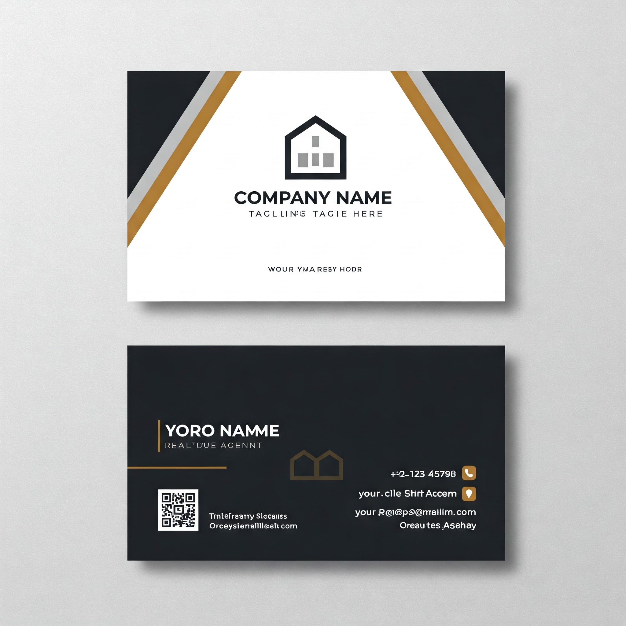
Designing the perfect visiting card is all about balancing branding, readability, and visual appeal. Here’s a full guide to help you design a professional, effective card—whether you’re doing it yourself or guiding a designer.
🎯 1. Define the Purpose & Brand Style
Ask yourself:
- Who is the card for? (Corporate, creative, local business, etc.)
- What vibe should it give? (Formal, modern, luxurious, quirky?)
- What colors and fonts match your brand identity?
📐 2. Standard Size & Orientation
- Standard Size (India): 9 x 5.3 cms
- Orientation: Horizontal is common, vertical is trendy
- Bleed Area: Texts and other items should be placed inside 5mm on all sides
🖋️ 3. Must-Have Information
Include:
- Name (Bold and prominent)
- Designation/Title
- Company Name
- Phone Number
- Email Address
- Website
- Location/Address (optional)
- Social Handles or QR code (if applicable)
🎨 4. Design Tips
- Fonts: Use max 2 fonts. Clean, readable typography is key.
- Colors: Stick to brand colors. Use contrast for readability.
- Logo Placement: Usually top-left or center
- Whitespace: Don’t overcrowd. Let the card breathe.
💡 5. Add Unique Touches
- QR Code: Link to portfolio, WhatsApp, location, or website
- Finishes: Glossy, matte, spot UV, foil, embossing for premium feel
- Card Stock: 300–350 GSM is ideal for sturdiness
🧪 6. Test It Visually
- Print a sample (or use mockups)
- Check alignment, bleed, and color accuracy
- Ensure text size is readable even in small print
⚠️ Common Mistakes to Avoid:
- Fonts that are too small or fancy
- Too much text or clutter
- Low-resolution images or logos
- Missing contact info or broken links in QR code


