In the world of professional printing, color accuracy and clarity are extremely important. Two common pre-press terms every designer and printer should know are Overprint and Knockout. Though they sound similar, they produce very different results on paper.
What Is Knockout in Printing?
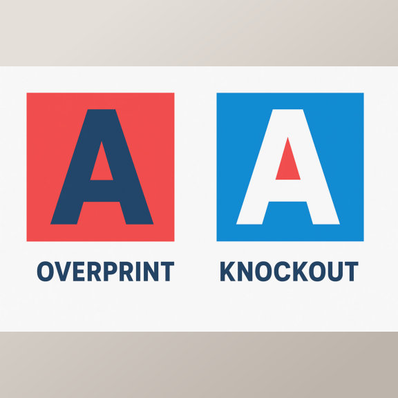
A Knockout happens when one color or object removes the color underneath it. This means the area beneath the top object is left blank, allowing the top color to print directly on the paper instead of mixing with the background ink.
For example, if you print white text over a red background, the red ink underneath the text is knocked out. This keeps the white text sharp, clean, and easy to read.
Benefits of Knockout:
- Prevents color mixing or muddy results
- Keeps text and logos crisp
- Ensures bright and accurate colors
What Is Overprint in Printing?
Overprint is the opposite of knockout. When you set an object to “overprint,” it prints on top of another color rather than removing what’s underneath. This can create darker or blended effects, depending on the colors used.
For example, printing blue text over a yellow background (with overprint enabled) may result in greenish text, because the inks combine.
When to Use Overprint:
- For black text over colored backgrounds (to avoid registration issues)
- For creating special blended color effects
- In spot color printing where ink transparency is desired
Be Careful: Unintended overprinting can cause colors to mix or make text unreadable — always preview using your design software’s overprint view before sending to print.
Key Difference: Overprint vs Knockout
| Feature | Knockout | Overprint |
|---|---|---|
| How it works | Removes color underneath | Prints over existing color |
| Result | Clear, solid top color | Blended or darker effect |
| Best for | Text, logos, sharp designs | Black text, artistic effects |
Final Thoughts
Both overprint and knockout are essential tools for professional print preparation. Understanding when and how to use each one ensures that your final prints look exactly as designed — with perfect color balance and sharp details.
Whether you’re printing business cards, flyers, or brochures, paying attention to these settings helps you achieve high-quality, professional-looking prints every time.